The Milk Curve: Examples
Example 1: Milking Curve indicates optimal cow preparation before milking
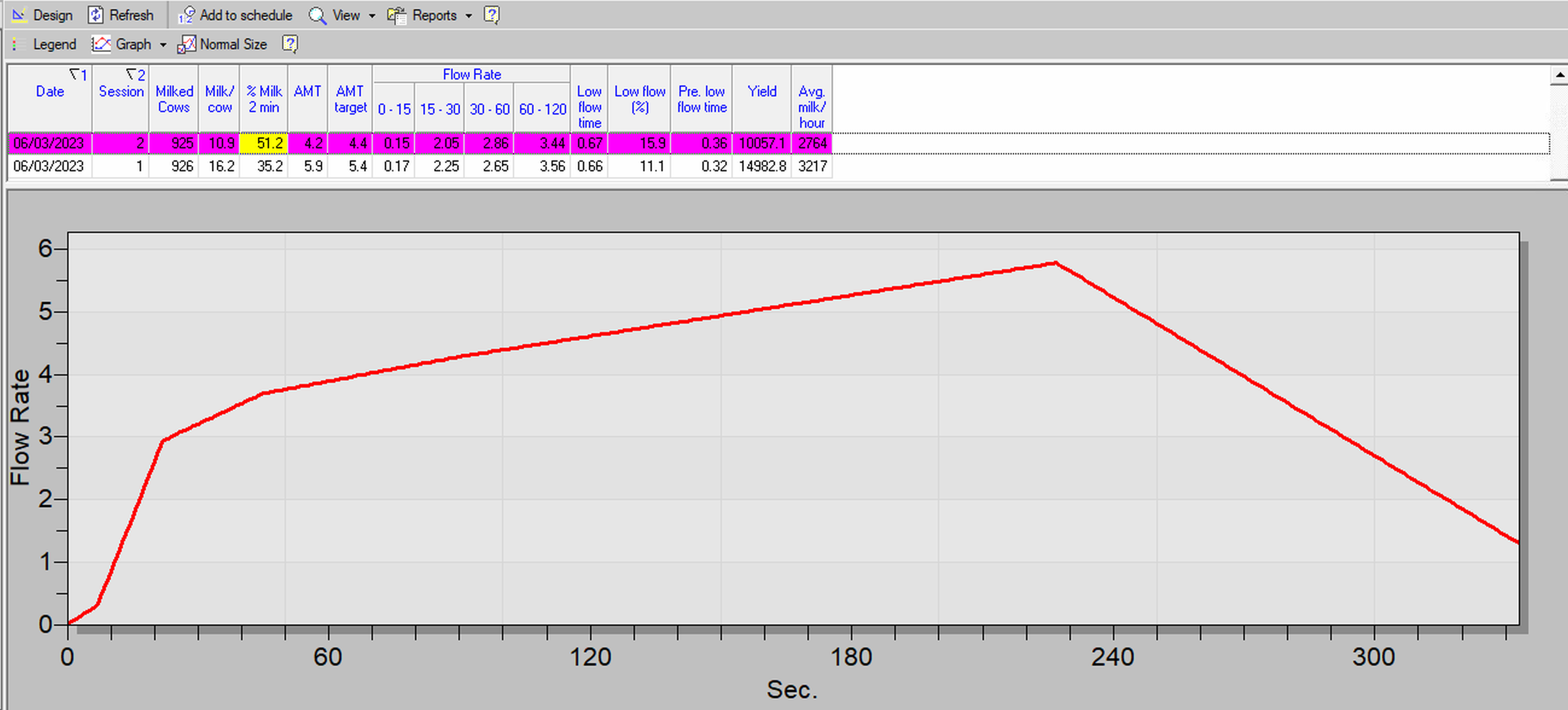
This can be seen by examining the following indicators:
-
Significant increase in the Flow Rate from 0-15, 15-30 and 30-60.
-
AMT (4.2 min) is low for cows with an average yield of 11.6 kg in this milking (comparing to AMT Target of 4.4).
-
Low Flow Time (0. 61 min) is low.
-
The % Milk 2 min is high: above 50%
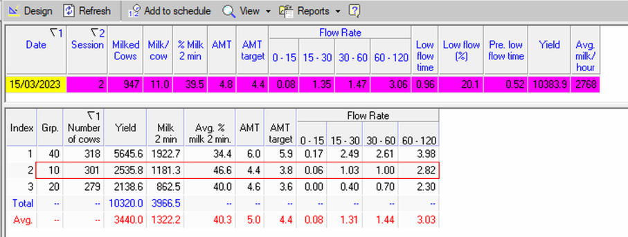
Example 2: Milking curve indicates bimodality and poor cow preparation for Group 10
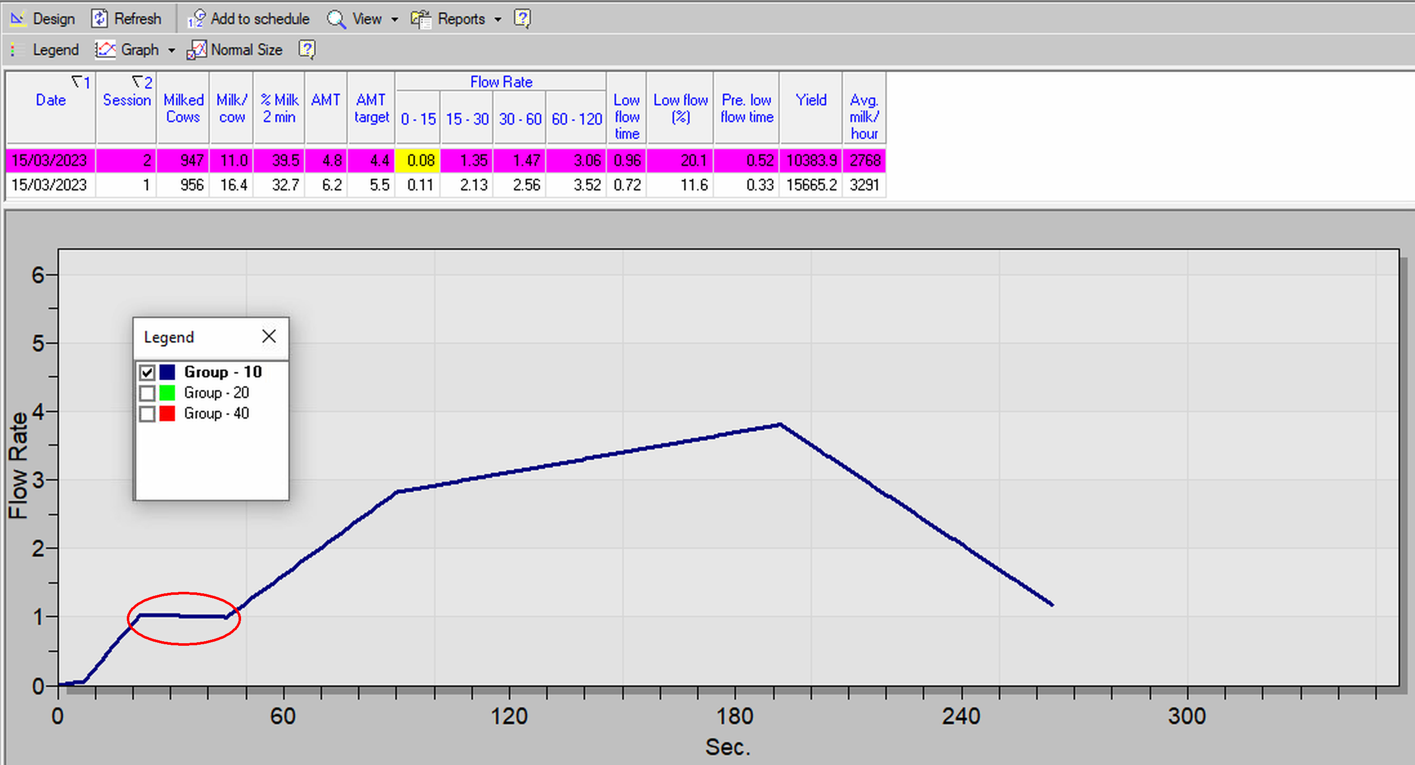
Preparation of the cows in Group 10 before milking was poor. This can be seen by opening the detailed group report and examining the following parameters:
-
There is a decrease in the Flow Rate from 15- 30 to 30-60 seconds: from 1.03 it decreased to 1.00. This is a case of bimodality. The flow at 60-120 sec (2.82) is low.
-
The AMT (4.4 min) is longer than the Target AMT (3.8 min), which is undesirable.
Example 3: Late cluster removal
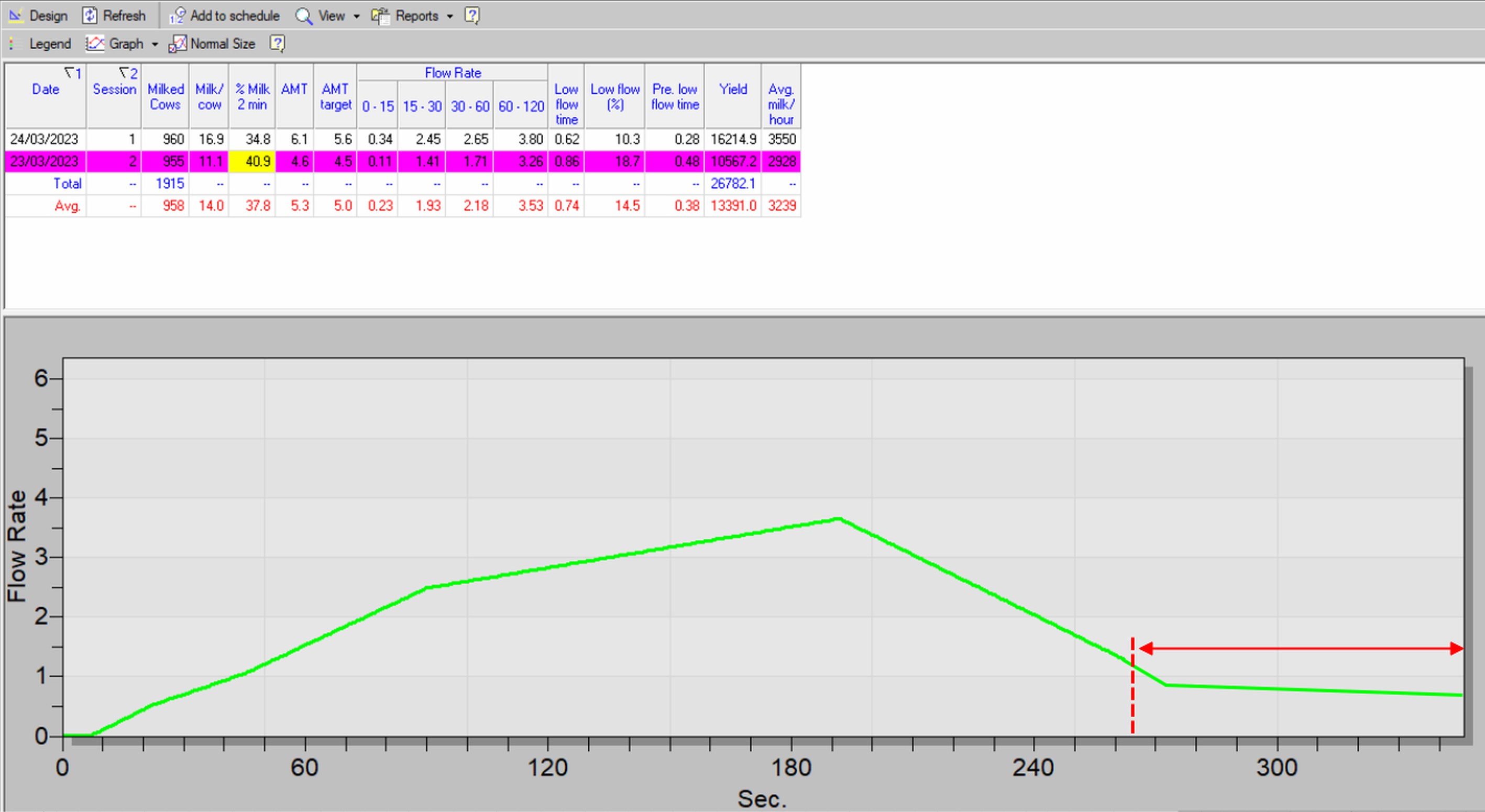
The red dash on the time line indicates the point in time, when the flow rate reached its optimal point for automatic cluster removal. However, in the example, the milking continues for almost an extra minute, even though the flow rate has dropped below 1 kg/minute. In such cases, check the Cluster Removal Parameters to ensure clusters are removed on time, prevent udder health problems associated to over milking, and increase parlor efficiency.